Every few months someone declares the popup dead. Spammy, intrusive, a relic. They're half right. The popup most stores run should be dead. But the popup as a tool? It's the most reliable on-site conversion surface you have — and it's quietly outperforming most of your paid channels.
The confusion comes from blaming the format for a strategy problem. A popup that gets ignored isn't proof that popups don't work. It's proof that that popup, with that offer, asking in that way, doesn't work. Those are very different obituaries.
Why popups still work
Attention spans keep shrinking, and the way people shop got worse for you specifically. A shopper rarely commits to one store. They open two or three tabs, compare, and drift. Most of the traffic you paid to acquire is going to leave without buying, and most of it is never coming back.
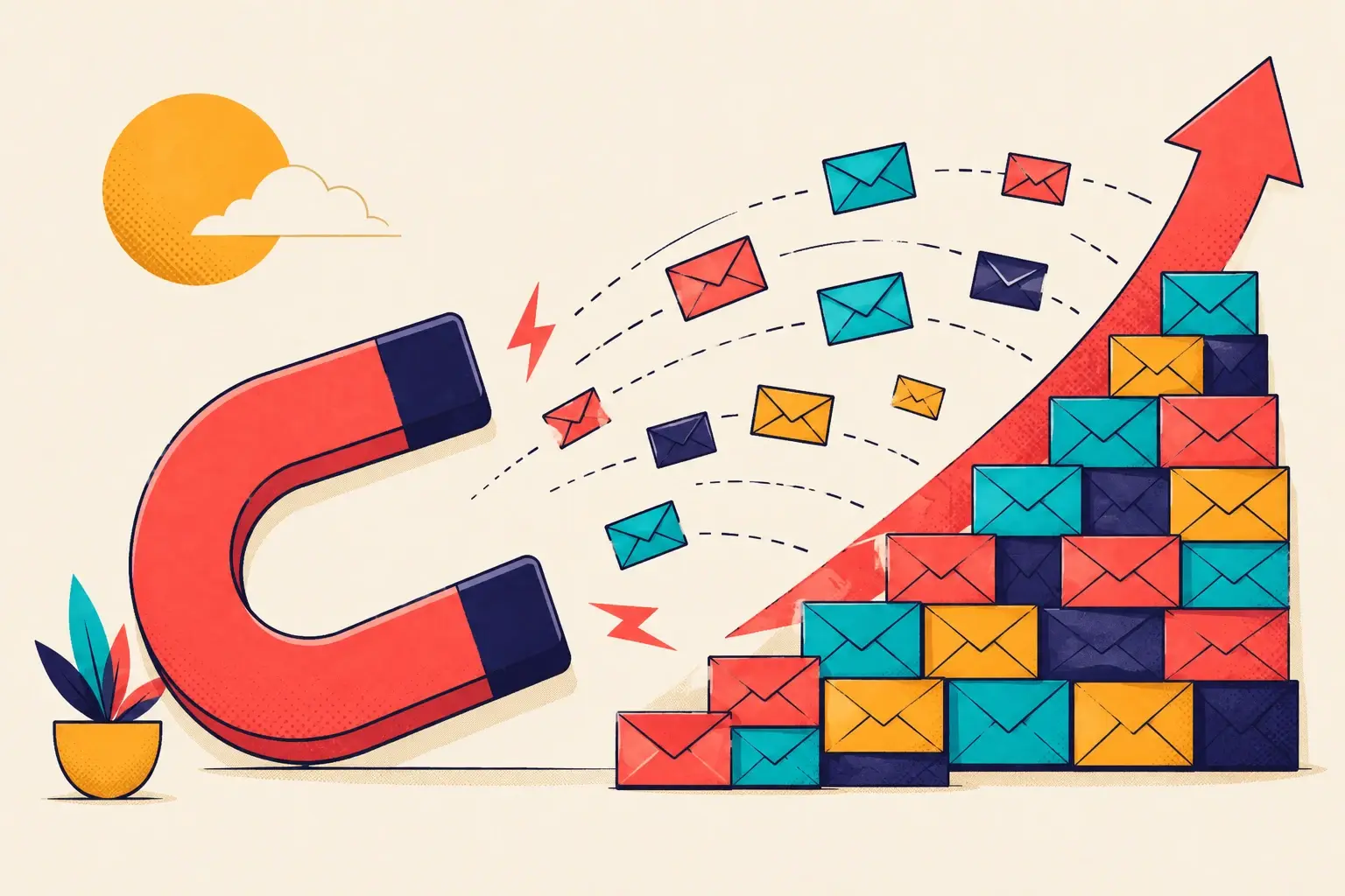
A popup is the one moment you get to interrupt that drift. It's not a nuisance bolted onto the page — it's your last chance to re-engage a visitor before they're gone for good. Done well, it converts a leaving stranger into an email address you own, on a channel you control, for free.
That's the part the "popups are dead" crowd skips. There is no cheaper way to capture intent at the exact moment it's about to evaporate. The question was never whether to interrupt. It's what you interrupt them with.
The status-quo problem
Open ten Shopify stores right now. Nine of them will hit you with the same popup: a box, a faint product photo, and some version of "Join our list — get 10% off your first order." Same layout, same copy, same ask.
Shoppers have seen that exact box thousands of times. They've stopped reading it. The X in the corner gets clicked before the headline even registers — it's muscle memory now. You didn't make an offer; you triggered a reflex.
That's the real death notice. Not the popup — the identical popup. When every store makes the same move, the move stops working. You're not competing on offer anymore. You're competing on whether anyone notices the offer at all.
When every store runs the same box with the same 10%-off line, you're not competing on the offer. You're competing on whether anyone notices it.
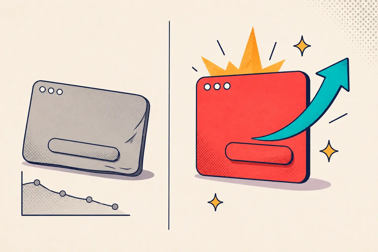
You can rewrite the headline, swap the photo, A/B test the button color — and you'll move the needle by a rounding error, because you're optimizing a format the visitor has already trained themselves to dismiss. The fix isn't a better version of the same thing. It's a different thing.
The fix is gamification
Gabe Zichermann, co-author of Gamification by Design, described gamification as "75% psychology, 25% technology." That ratio is the whole point. A gamified popup isn't a fancier widget — it's a popup built around how people actually decide to act.
It works for three concrete reasons:
- It supplies motivation. A static "10% off" is a known, slightly boring payoff. "Spin for a chance to win up to 40%" is a reason to lean in. The possibility of a bigger reward is more compelling than the certainty of a small one.
- It breaks one big ask into small steps. A standard popup demands the email up front, before the visitor has done anything or felt anything. A game flips the order: play first, hand over the email after. The first action costs almost nothing, so it actually gets taken — and once someone has engaged, giving an email to claim what they won feels natural, not extractive.
- It creates a trigger to finish. A shopper who wins a coupon now holds something with a clear next step and a reason to use it soon. That's a far stronger nudge toward checkout than a discount code sitting unread in an inbox.
This is also why the email numbers move. We've seen stores that swap a tired static popup for a gamified one see their list-growth rate jump well beyond what tweaking copy ever delivered — the kind of step change you don't get from optimizing a format shoppers have learned to ignore. If you want the deeper mechanics, our anatomy of a 13.2% popup breaks down exactly where the lift comes from, and the consumer psychology behind it covers why it holds up.
Stop optimizing a popup shoppers ignore.
Swap your static box for a game in minutes — no code, no developer.
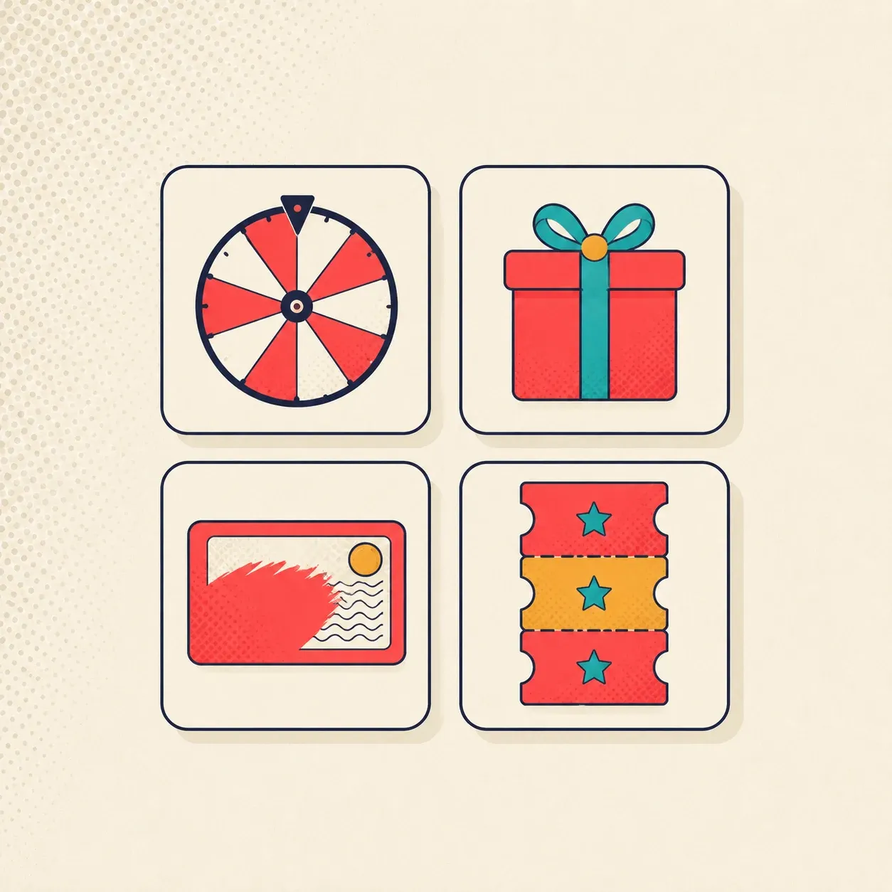
The four games
Gamification isn't one widget. It's a small set of mechanics, each suited to a different brand and audience. woohoo runs four:
- Spin-the-wheel. The classic. A visitor enters an email, spins, and lands on a prize slice. High energy, instantly understood, and the easiest first action you can offer.
- Pick-a-gift. The shopper chooses one of several gift boxes to reveal what's inside. Calmer than a wheel, less carnival — a better fit for premium and considered-purchase brands.
- Scratch card. A digital scratch-off that reveals a hidden discount. The reveal feels earned, and the small physical-feeling action makes the reward land harder.
- Reel of coupons. A slot-style reel that spins to a prize. Familiar mechanic, fast, and tuned for shoppers who respond to a bit of suspense.
Same job in every case: replace a flat ask with a moment of play, so the email becomes a side effect of an action the shopper already wanted to take. Pick the mechanic that matches your brand — see how stores run these as campaigns for examples by category.
It's still a popup.
Gamification doesn't mean abandoning the popup — it means upgrading what's inside it. Same surface, same triggers, same targeting rules you already understand. The only thing that changes is whether the visitor's first instinct is to play or to close.
Reboot the strategy
The popup isn't dead. The version of it that every store copied off every other store is dead — and it deserved to be. Shoppers didn't reject the channel. They rejected the laziest possible use of it.
So don't kill your popup. Kill your popup strategy, and rebuild it around something a visitor actually wants to engage with. Give them a reason to act, make the first step nearly free, and hand them a trigger to finish. That's not a gimmick. That's just respecting how people decide — which is the only thing that ever made a popup work.