Popups got a bad name for one reason: most stores treat them as a single event — fire on load, ask for an email, hope. Shown that way, they're an interruption, and shoppers have learned to close interruptions before reading them.
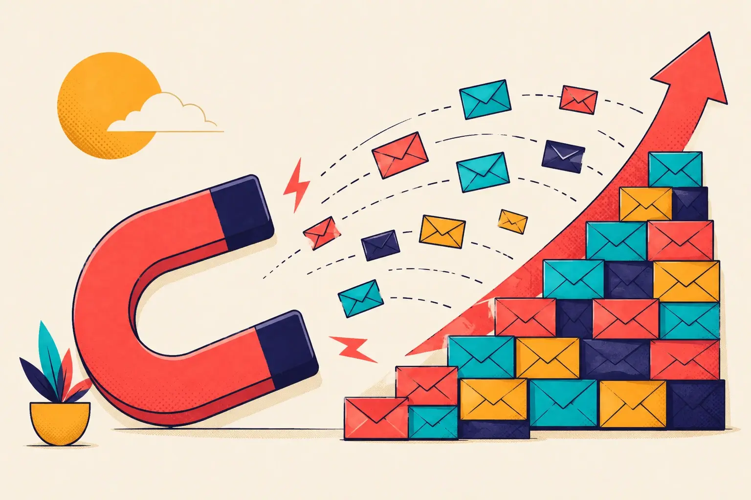
But the popup isn't what's broken. The strategy is. A popup shown at the right moment, in the right place, isn't an interruption at all — it's a well-timed offer. Below are five placements that turn the popup from a thing shoppers dodge into a thing that moves revenue. Most stores use one of them. The good ones use all five.
Welcome new shoppers
The on-load popup gets a bad rap, and the plain version earns it — a flat "10% off for your email" the moment someone arrives is the most ignored object on the internet. But the placement is sound. A first-time visitor genuinely is deciding whether to stick around; a welcome offer can tip that decision.
The fix is the format, not the timing. Swap the static box for a gamified welcome popup — a spin-the-wheel or scratch card. The shopper engages with something instead of being asked to hand over an address cold, and the discount they win gives them a concrete reason to start browsing with intent.
At exit intent
Some visitors will leave no matter what's on the page. Exit intent is your one clean shot to change their mind — the popup fires the moment the cursor heads for the tab bar or the back button.
Because this is a last chance, the offer should carry real weight. A game gives the leaving shopper a reason to pause and engage. A one-time, time-sensitive discount gives them a reason to stay. Either works; what doesn't work is a soft, generic message. The shopper is already halfway gone — meet that with something worth turning around for.
Exit intent is the only popup placement where you've got nothing left to lose. Spend your best offer here.
Before cart abandonment
A shopper on the checkout page has done almost all the work — picked products, added them, started the form. If they stall here, the gap between you and the sale is small, and the popup that addresses it should be small too.
This is the one placement where you skip the game. Keep it simple and direct: a clean popup with a time-sensitive discount that nudges them over the line. No friction, no spinning, no extra clicks — just a clear reason to finish now. If you want to go deeper on recovering these shoppers, see our guide to reducing cart abandonment.
Put the right popup in the right place.
Build welcome, exit, and cart popups from one editor — and choose exactly when each one fires.
On product-page abandonment
A shopper who studies a product page and then moves to leave is telling you something specific: they were interested, and something stopped them. A popup here works best when it answers the likely objection rather than just discounting.
Depending on what's stalling them, that might be more product information, a low-stock notice that adds urgency, a discount that closes a price gap, or a customer testimonial that settles a trust question. Gamification works here too — a quick game keeps the shopper on the page long enough to reconsider. Match the popup to the doubt and you re-engage them before the tab closes.
Each placement wants a different popup.
The mistake is building one popup and showing it everywhere. A welcome game, an exit-intent offer, a lean checkout nudge, and a product-page reassurance are four different jobs. Build them as four different popups — see how to convert every type of shopper for who each one is for.
On the thank-you page
The thank-you page is the most underused real estate on a Shopify store. The shopper just bought from you — trust is at its peak and the credit card is still warm. Most stores show them a static receipt and waste the moment.
Use a popup here to recommend similar or popular products. It drives repeat purchases while intent is high, and it improves discoverability — surfacing items the shopper would never have found on their own. A buyer is the easiest person on your store to sell to. The thank-you page is where you do it.
Interrupt vs. engage
Every placement here comes down to one distinction. A popup fired without regard for where the shopper is or what they're doing is an interruption — and you lose them. A popup matched to the moment is an engagement — and you win a customer.
You don't have to deploy all five at once. Start with a welcome game and an exit-intent offer, measure, then add the cart, product-page, and thank-you placements as you go. The principle never changes: interrupt them and you lose them; engage them and you win a customer.