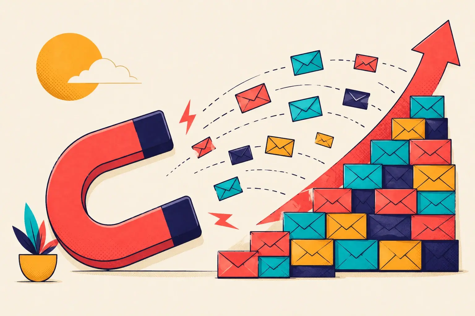
Open ten Shopify stores and you'll see the same popup nine times: a flat box offering 10–15% off in exchange for an email. It works well enough that nobody questions it — which is exactly the problem. When every store runs the identical play, the popup stops being an offer and starts being wallpaper.
Shoppers don't reward wallpaper. They reward a journey that feels built for them. Personalization is no longer a nice-to-have you bolt on after launch — it's the thing that decides whether a visitor reads your popup or reflexively hits the X. Below are five ways to make a popup feel personal, ranked by how much lift they tend to deliver.
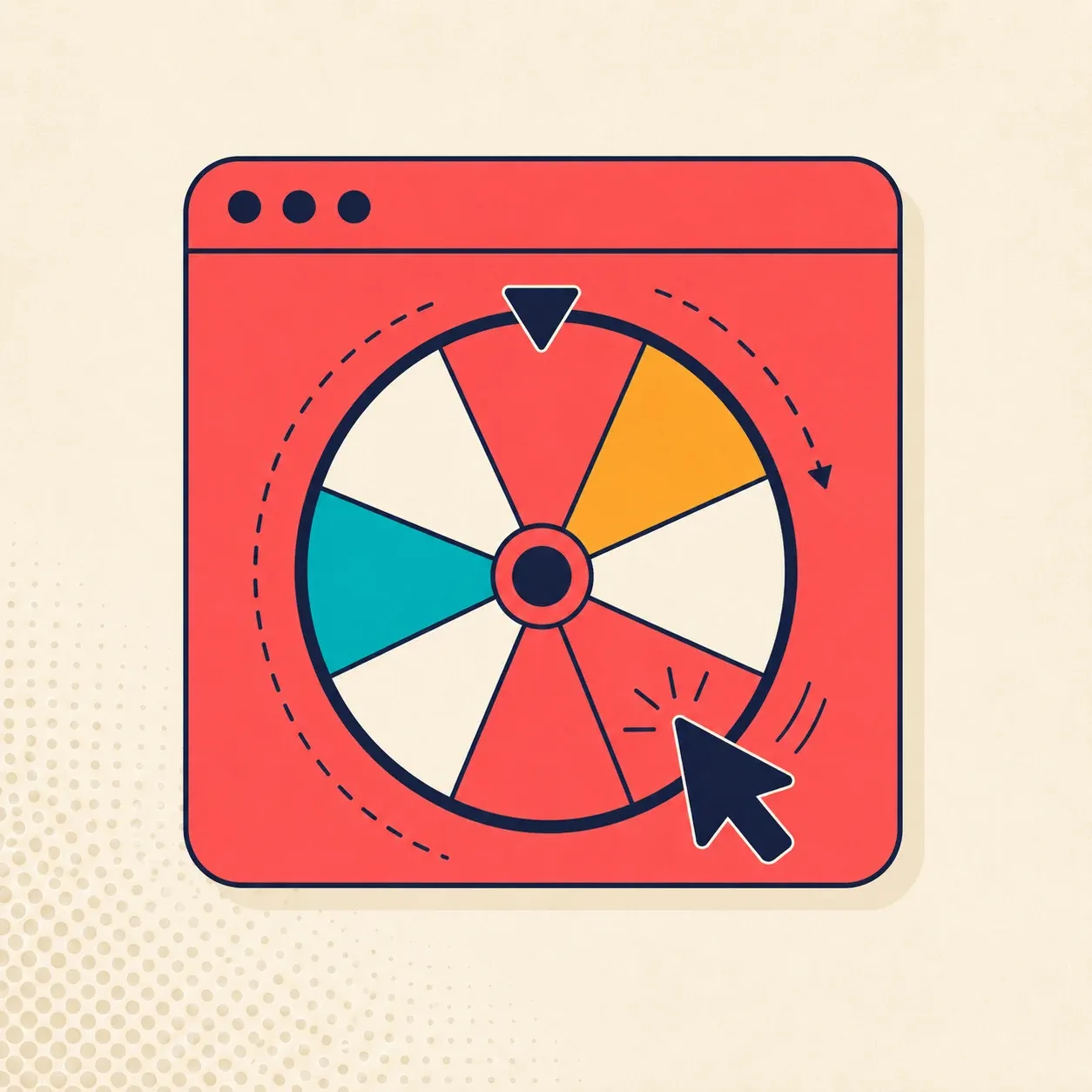
Gamify the popup
The fastest way to make a popup feel personal is to stop handing the discount over and let the shopper earn it. Turn the box into a spin-the-wheel, a pick-a-gift, a scratch card, or a reel of coupons. The mechanics differ; the psychology is the same.
A discount that's been won feels like an outcome the shopper produced, not an ad they received. That changes two things at once. It lifts the opt-in — spinning is more inviting than typing into a static form — and it lifts redemption, because people use codes they feel ownership over far more reliably than codes that simply landed in their inbox.
A discount handed out is an ad. A discount won is an achievement. Shoppers treat the two completely differently.
If you only change one thing about your popup this quarter, change this. Everything below makes a gamified popup sharper — but the game is the foundation.
Build urgency into the message
A game gets attention. Urgency converts it. Without a reason to act now, even a beautifully built spin-the-wheel underperforms — the shopper spins, sees the prize, thinks "later," and never comes back.
Personalized urgency means the copy speaks to this moment, not a generic countdown. "Your prize is reserved for the next 15 minutes." "This offer expires when you leave the page." The point isn't to manufacture panic — it's to give the shopper a concrete answer to the only question that matters: why now instead of later? Pair the game with a deadline and you close the loop.
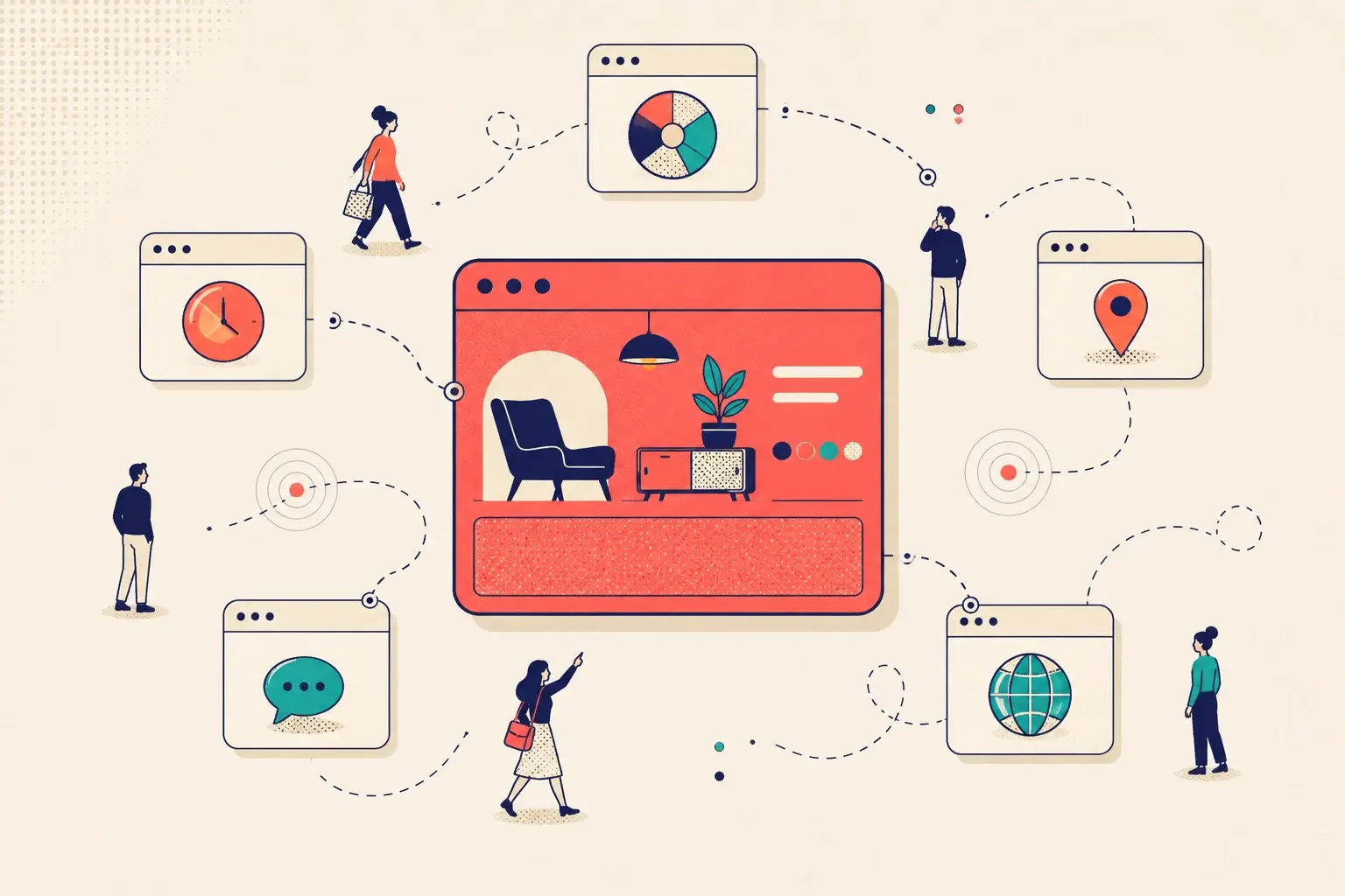
Target active browsers only
The single biggest personalization mistake is showing the same popup to everyone the instant they land. A visitor who arrived three seconds ago hasn't decided anything yet. A visitor who's scrolled two product pages and lingered on a collection has shown you real intent — and that's who should see the offer.
Targeting active browsers does two jobs. It protects the experience of cold visitors who aren't ready, and it puts your best offer in front of the people most likely to act on it. When the art brand Framebound narrowed their popup to actively-browsing shoppers, their email list grew roughly tenfold — not because the popup changed, but because the audience did.
Personalization is mostly a targeting problem.
Merchants tend to think personalization means more popup variants. Usually it means fewer — shown to the right people. Decide who should see each popup before you obsess over what it says. The same offer feels personal to a high-intent browser and intrusive to someone who just clicked a link. For more on this, see our breakdown of shopper segments and the metrics that tell you it's working.
Write the way you talk
Read your popup copy out loud. If it sounds like a press release, it won't feel personal. The fastest fix in copywriting is also the cheapest: write in second person.
"You can win 15% off" beats "Win 15% off" — not because the words are clever, but because one addresses a person and the other addresses a crowd. "You" makes the shopper the subject of the sentence. It's a tiny change that signals the whole popup was written for them. Apply it everywhere: the headline, the button, the prize labels. Conversational, direct, and unmistakably aimed at the reader.
Build a popup that feels personal in minutes.
Pick a game, match it to your brand, and set who sees it — no code, no developer.
Localize for region
If you sell across borders, a popup in the wrong language is a popup ignored. Localization is the most concrete form of personalization there is — it tells the shopper, in their own words, that you built the experience with them in mind.
Match language and region to the visitor. Adjust currency in the offer. Where it makes sense, reflect local shipping or seasonality in the copy. A shopper in Berlin who sees a popup in German, priced in euros, doesn't experience it as a popup at all — they experience it as a store that knows them. That feeling is the entire goal.
Putting it together
There's no single switch that makes a popup personal. The five tactics here stack: a game gives the shopper a reason to engage, urgency gives them a reason now, targeting puts it in front of the right person, second-person copy makes it feel addressed to them, and localization proves it.
You don't need all five on day one. Start with the game and the targeting — that's where the lift concentrates — then layer the rest. The bar is simple. A personalized popup grabs attention and makes the shopper feel the need to interact, instead of the need to close. Build to that bar and the email list takes care of itself.